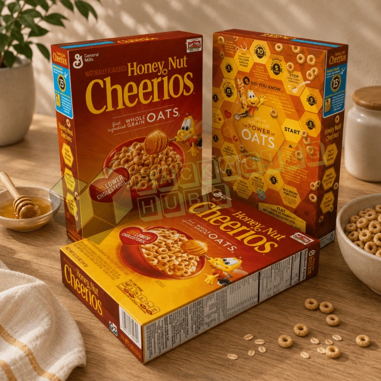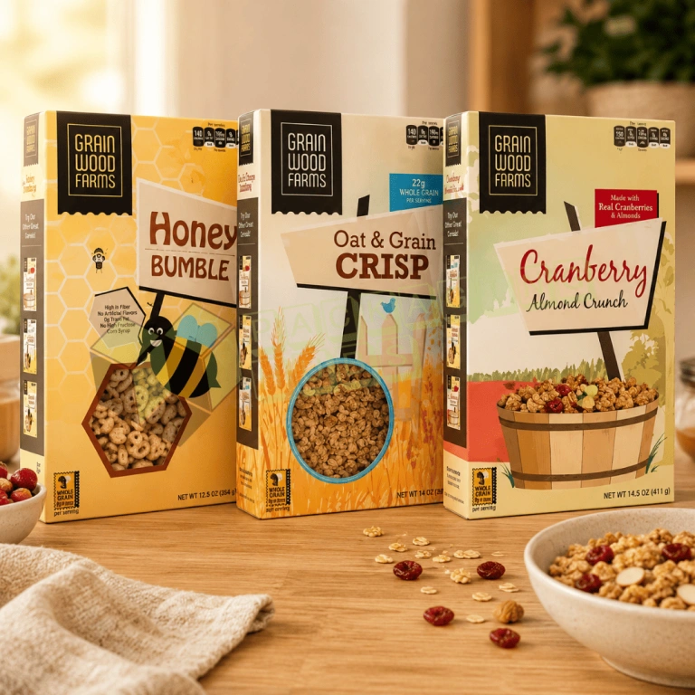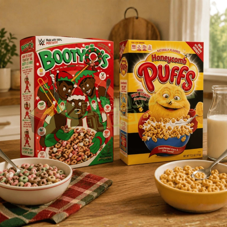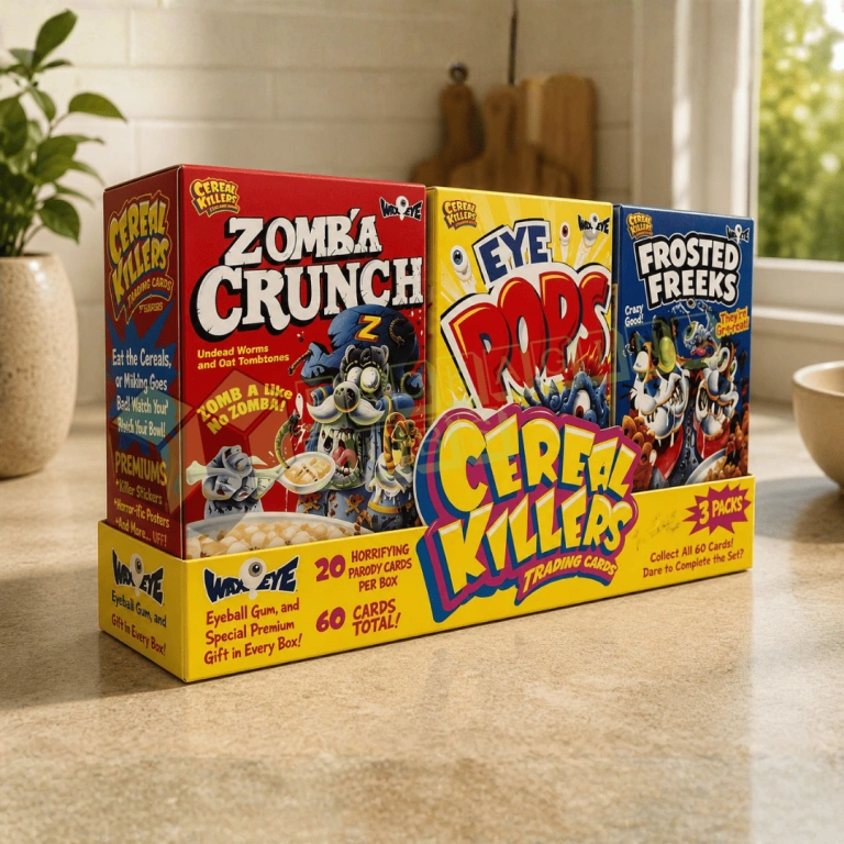
Free design support and free U.S. shipping. No minimum order.
Custom Cereal Boxes for retail brands, private-label food companies, hotels, schools, subscription programs, events, and product launches. Available with custom dimensions, mini formats, premium printing, retail-ready finishes, zero MOQ, free design support, flexible lead-time options, and free shipping
A Cereal Box has to perform several jobs at once. It must hold the approved inner liner, keep its shape through case packing and retail handling, communicate the flavor quickly, carry essential product information, scan properly at checkout, and give shoppers a reason to choose the product. When the carton is too weak, too large, visually crowded, or poorly planned, the brand can lose value before the customer ever tastes the cereal.
Packaging Hubs manufactures Custom Cereal Boxes for established food companies, private-label brands, granola makers, health-focused product lines, hotel breakfast programs, school meal suppliers, subscription sellers, promotional campaigns, and startups across the USA. Each structure is developed around the sealed inner pouch, settled product volume, net quantity, shelf orientation, case count, artwork, and distribution route.
Every project can include custom dimensions, zero MOQ, free design services, digital or offset printing, premium finishes, flexible lead-time options, and free shipping across the USA. Share the product format, pouch measurements, order quantity, and retail goals to receive a structure and quote based on the actual packaging program.
Cereal packaging often fails because the artwork receives attention before the physical package is resolved. A bright front panel cannot correct a carton that bows under the inner pouch, leaves excessive empty space, or crushes when several units are packed into a master case.
The finished carton should follow the settled liner, not an empty bag or a guessed net-weight conversion. Flakes, loops, clusters, granola, puffed grains, and coated pieces all settle differently. Two products with the same net weight may therefore require different dimensions and board strength.
Packaging Hubs begins with the filled pouch, closure style, shelf-facing width, board grade, and shipping environment. This approach improves fit, protects panel shape, and creates a stronger base for the artwork. A California natural-food startup may need a compact kraft-style carton, while a national grocery supplier may need highly repeatable case counts and scan-ready panels. The product, retail channel, and distribution method should shape the package before finishes are chosen.
The table below connects common filling, retail, and distribution failures with practical structural corrections.
| Packaging problem | Why it happens | Packaging Hubs solution | Practical buying benefit |
| Top panels bow or open | The liner pushes against shallow panels or weak tucks | Adjust headspace, depth, board grade, and tuck length | Cleaner shelf presentation and closure |
| Side panels crush in cases | Board and case fit do not support stacking | Match caliper, grain direction, and master-case dimensions | Better shape retention in storage |
| The product looks underfilled | Stock dimensions leave too much empty space | Right-size the carton from realistic fill tests | Better value perception and less waste |
| Flavor variants are difficult to identify | Artwork lacks a consistent SKU system | Standardize colors, icons, names, and panel positions | Faster selection and fulfillment |
| The inner pouch snags | Tight dimensions or closures contact the liner | Refine clearance, dust flaps, locks, and loading direction | Smoother packing with less damage |
| Barcodes scan inconsistently | The symbol sits near folds, texture, or low contrast | Reserve a flat, high-contrast scan zone | Easier checkout and inventory handling |
| The carton tears after opening | Scores or board strength do not suit repeated handling | Improve score placement and board selection | Better pantry use |
| Retail cartons arrive scuffed | Printed units ship without a protective case | Use a fitted corrugated outer carton | Cleaner surfaces at delivery |
Material strength alone is not enough. Fit, closure, liner clearance, barcode planning, and the master case must work together before the final print file is approved.
The following specifications provide a practical framework for a custom retail carton. Final decisions should follow the filled pouch, order quantity, selling channel, and delivery route.
| Specification | Available direction | What the choice changes |
| Dimensions | Fully custom length, width, and depth | Shelf footprint, liner fit, material use, case count, and shipping volume |
| Structure | Straight tuck, reverse tuck, auto-lock bottom, sleeve, display carton, gable-style promotion pack, or mini format | Packing speed, closure strength, opening experience, and retail display |
| Paper stock | SBS paperboard, cardstock, kraft paperboard, recycled-content options, or corrugated board | Print clarity, stiffness, surface character, weight, and cost |
| Board thickness | Selected around carton size, fill weight, panel span, and stacking requirement | Score quality, rigidity, bow resistance, and closure performance |
| Printing | Digital, offset, flexographic, exterior printing, interior printing, or both | Detail, run economics, personalization, and repeat consistency |
| Color system | CMYK, PMS spot colors, monochrome, or unprinted stock | Photography, gradients, logo consistency, and proofing needs |
| Finishes | Aqueous coating, matte, gloss, UV, spot UV, foil, embossing, or debossing | Surface feel, color intensity, handling resistance, and price |
| Proofing | Flat proof, 3D mockup, and physical sample when appropriate | Artwork flow, fit, closure, shelf presence, and filling review |
| Quantity | Zero MOQ with scalable wholesale production | Supports prototypes, limited launches, and larger repeat orders |
The best specification is not the one with the longest option list. It is the combination that fits the liner, protects the panel shape, supports packing, and communicates the product clearly without unnecessary material or production cost.
A reliable carton begins with a production-style fill test. Fill and seal the approved inner pouch under realistic conditions, then allow the cereal to settle as it would during case packing and distribution. Measure the maximum width, depth, and height without squeezing the product into an unnatural shape.
The carton should provide enough clearance for loading, sealing variation, dust flaps, top folds, and normal production tolerances. However, too much space allows the liner to slump and makes the package feel underfilled. Excess depth also reduces case efficiency and may increase storage and shipping volume.
A standard retail pack, family-size carton, and single-serving box need different proportions even when the brand identity remains consistent. Packaging Hubs can create one structural family with related facing widths, panel hierarchy, and case counts while adjusting depth and height for each fill volume.
Physical sampling becomes especially valuable when the cereal density, net quantity, pouch film, filling equipment, or board grade changes. The sample should be tested with the real liner and realistic product weight rather than an empty mockup.
Different serving formats require different structural priorities. The table below compares the most useful directions.
| Product format | Recommended structure | Main requirement | Buyer consideration |
| Single serving | Compact tuck carton or small sleeve | Easy opening, clear flavor identification, and low empty space | Small panels require disciplined label and artwork hierarchy |
| Standard retail pack | Straight tuck or reverse tuck folding carton | Efficient assembly, printable surface, and pantry-friendly shape | Board and closure must suit the filled liner |
| Large family size | Reinforced folding carton or auto-lock bottom | Stronger sidewalls and dependable base support | Larger panels may need heavier board and tighter case planning |
| Variety pack | Printed outer carton holding several labeled portions | Organized count and flavor visibility | Internal movement and pack sequence need control |
| Subscription sampler | Corrugated mailer or paperboard set box with divisions | Transit protection and planned presentation | Shipping and retail display may require separate structures |
| Foodservice case | Corrugated shipper around approved inner packs | Case strength, count identification, and warehouse handling | Retail decoration may be unnecessary on the outer case |
This comparison helps brands avoid forcing one carton style across every product. A lightweight mini pack can use a simple tuck, while a deeper family format may need stronger closure and panel support.
Paperboard remains a practical material for retail cereal packaging because it provides broad printable surfaces, ships flat before assembly, and creates a familiar shelf shape. Brands can use Cardboard Boxes for standard breakfast products, granola, variety sets, dry-food promotions, and private-label programs.
SBS paperboard offers a bright, smooth surface for food photography, mascot artwork, small text, gradients, and premium finishes. Other cardstock grades can support cost-conscious programs when their thickness and grain direction match the carton size and filled weight.
The board should fold cleanly without cracking at scores or feeling bulky at the closures. A material that is too light may bow, while an unnecessarily heavy stock can increase cost and create difficult folds. Packaging Hubs can compare board grade, surface, print method, closure, and case performance before production begins.
Straight tuck and reverse tuck formats remain popular because they assemble efficiently, store flat, and give brands multiple connected panels for design and product information. Tuck Boxes can support standard breakfast cartons, granola packs, mini portions, dry mixes, and promotional food products.
Straight tuck structures place the top and bottom closures on the same side, which may support a cleaner front-to-back panel relationship. Reverse tuck structures place the closures on opposite sides and can improve material layout for certain dimensions. Larger or heavier packs may require an auto-lock bottom or reinforced closure rather than simple friction tucks.
Dust flaps, score position, tuck length, and board thickness influence how the package closes on the production line and opens at home. Testing the filled liner inside the actual structure helps identify snagging, panel pressure, and closure problems before a full run.
The inner liner is usually the direct food-contact component. It helps provide the seal and barrier performance selected by the cereal producer. The outer carton provides structure, brand communication, labeling space, stacking support, and protection from ordinary handling.
An ordinary paperboard carton should not be presented as the component that keeps cereal fresh unless the complete system and supporting evidence justify that claim. The liner specification should follow the formulation, fat content, aroma sensitivity, moisture sensitivity, filling process, seal method, desired shelf life, and intended storage conditions.
Packaging Hubs can build the secondary carton around the approved filled liner. The responsible food company should approve the direct-contact materials, adhesives, inks, coatings, and conditions of use. The FDA provides official information on substances used in food packaging through its Food Ingredients and Packaging resources.
Printing should help shoppers recognize the product, flavor, brand, and audience within seconds. The table explains where each major option fits.
| Printing or color option | Best use | Advantages and buyer implications |
| Digital printing | Short launches, prototypes, personalized runs, and several low-volume flavors | Reduces setup requirements and supports flexible quantities, although high-volume unit economics may favor offset |
| Offset printing | Larger retail programs, detailed food imagery, and repeat production | Produces fine detail and controlled larger runs but requires more setup and artwork discipline |
| Flexographic printing | Corrugated shipping cases and simplified outer packaging | Supports efficient bold graphics, product codes, and handling information on distribution packs |
| CMYK | Photography, gradients, illustrations, and full-color campaigns | Reproduces a broad process-color range, though some bright screen colors cannot be matched exactly |
| PMS spot colors | Logos and critical brand or flavor colors | Provides closer control over selected colors across cartons, cases, and promotional components |
| Interior printing | Activities, brand stories, preparation ideas, or loyalty content | Extends the experience after opening but adds print coverage and requires food-system review where relevant |
A strong print plan controls hierarchy rather than filling every panel. Packaging Hubs can review bleed, safe zones, resolution, font preparation, color conversion, panel flow, and finish placement through its free design service.
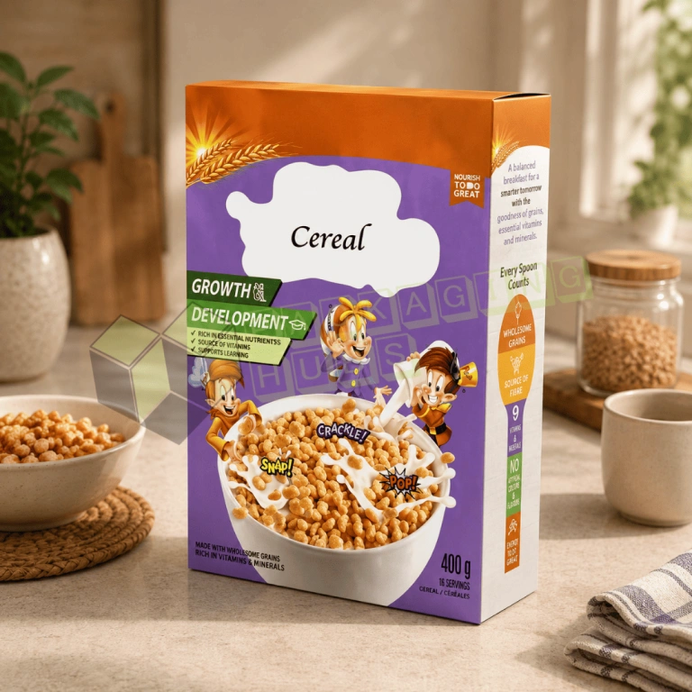
A successful cereal box design assigns a different job to each panel. The front should communicate the brand, product name, flavor, cereal style, and key approved positioning quickly. Side panels can support nutrition information, ingredients, manufacturer details, preparation guidance, or variant identification. The back panel has more room for recipes, brand storytelling, activities, or campaign content.
The cereal image should represent the approved serving presentation accurately. Important words, faces, and mascot features should remain away from folds, glue seams, and panel edges. The barcode and required information should be mapped before decorative artwork fills the available space.
Effective carton systems also create a repeatable structure across flavors and sizes. A consistent logo location, type hierarchy, image angle, and information layout help shoppers recognize the range. Flavor colors and icons can change without making each SKU look like a different company.
For customized cereal boxes, the brand should approve one master panel system before adapting it to multiple products. This reduces late-stage corrections and helps production teams manage variants more consistently.
Custom mini cereal boxes work well for hotels, schools, events, corporate breakfasts, promotional programs, sample campaigns, travel-style service, and portion-controlled products. Their compact format makes them easy to distribute, but it also creates limited panel space.
The design must prioritize the product name, flavor, brand, net quantity, and required information without shrinking text beyond practical readability. Side-panel depth may be too narrow for complicated copy, so the information hierarchy should be tested on the actual dieline rather than a large screen mockup.
Mini cartons may use a tuck structure, small sleeve, or promotional format depending on how the approved inner portion is packed. Several mini units can also sit inside a printed variety carton for subscription programs or gift sets.
A customized cereal box for an event may carry a guest name, date, sponsor, theme, or campaign message. Digital printing often supports these shorter personalized runs more efficiently than a conventional high-volume setup.
A blank cereal box is useful for fit testing, filling trials, photography planning, line checks, shelf mockups, and internal approvals before full-color production. It can reveal whether the pouch catches on a tuck, the top bows, the depth feels excessive, or the master case fits poorly.
A plain cereal box can also support private-label trials, minimalist branding, or temporary labels. A packaging brief marked cereal box plain usually means the buyer wants unprinted or lightly printed stock, but the final specification should still define the board, closure, dimensions, and coating.
The phrase ceral box sometimes appears as a spelling error in working files or panel notes. Artwork quality control should correct it before printing so the customer-facing package remains professional. Likewise, a minimally printed package still needs deliberate typography, label placement, and structure if it will reach retail shelves.
Minimal design does not mean incomplete planning. A one-color logo on kraft or white board can look intentional when the fit, surface, panel balance, and information hierarchy are correct.
A personalised cereal box can turn an everyday breakfast product into an event favor, corporate gift, birthday item, school promotion, hospitality welcome pack, or influencer mailer. Personalization may include names, dates, regional artwork, sponsor marks, event colors, short messages, or numbered editions.
The personalized layer should not interfere with product identity, net quantity, nutrition information, ingredients, allergens, barcode space, or other required content. Therefore, brands should define fixed regulatory panels and flexible campaign panels before creating multiple versions.
Digital printing can make short personalized carton runs more practical, particularly when names or artwork change frequently. For larger campaigns, brands may keep one printed carton and use variable labels, sleeves, or stickers for the personalized element.
A Texas conference may need branded breakfast packs for attendees, while a New York hotel group may use regional artwork across several properties. Both projects benefit from one approved structure and a controlled area for variable content.
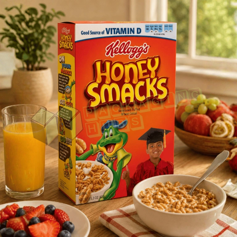
Character packaging can make a product easier to recognize, especially for family ranges, nostalgic concepts, and limited releases. Buyers searching for cereal with frog on the box often remember the mascot before the precise product name. A new brand can develop an original frog, animal, or fictional character, but it should avoid copying protected characters, logos, or distinctive competitor trade dress.
Funny cereal box can use wordplay, puzzles, short stories, unusual serving ideas, collectible artwork, or rotating back-panel content. Humor should suit the audience and should not obscure important information or imply ingredients, nutrition benefits, or product qualities that the cereal does not have.
A mascot should have a defined role. It can introduce flavors, guide customers to a QR code, explain an activity, or connect several products. Expression, pose, color, and scale should remain readable from normal shelf distance.
The strongest character systems stay consistent across cereal box designs while changing accessories, backgrounds, or flavor cues for each SKU.
Most prepared foods sold in the United States, including cereals, require food labeling. Artwork should reserve clear areas for the statement of identity, net quantity, Nutrition Facts, ingredients, allergen declarations where applicable, and the name and address of the responsible business. The exact requirements depend on the product and should be confirmed by the food company and its compliance professionals.
The FDA states that food labeling is required for most prepared foods, including cereals, and provides related rules and guidance through its Nutrition, Food Labeling, and Critical Foods resources.
Packaging Hubs can reserve customer-approved information zones on the dieline. Small text should remain away from folds, locks, strong glare, and textured finishes. Promotional graphics should be designed around these areas instead of forcing required copy into limited space near the end of the project.
Retail units, cases, and logistics levels may need different identifiers and barcode formats. The consumer unit usually needs a clean, flat, high-contrast scan area, while an outer case may carry additional product, lot, or shipment information.
GS1 US explains that standards and barcodes help packaged-food businesses share product data, manage inventory, and improve traceability across retail grocery supply chains. Its food and retail grocery resources also distinguish consumer UPC use from higher-level case identification. Brands can review the official GS1 US food and retail grocery guidance when planning product and case data.
Packaging Hubs can provide a suitable print zone, but the product owner should supply and approve the correct code, number, size, quiet zone, and packaging level. Foil, embossing, folds, seams, and rough stock should remain outside the barcode area unless testing confirms reliable scanning.
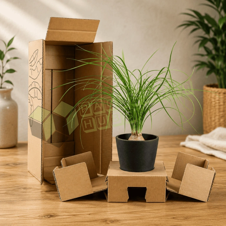
Retail cartons need a separate distribution plan because their primary job is shelf presentation, not carrying every warehouse and shipping load alone. Single wall Corrugated Boxes can protect grouped retail units during storage, wholesale movement, pallet handling, and suitable parcel routes.
The outer case should follow the number, orientation, weight, and dimensions of the retail packs. Excess space allows boxes of cereal to shift and crush at corners, while an overly tight case can abrade printed surfaces or deform the panels. Pads or dividers may improve stability when carton proportions create uneven rows.
Case printing can include product name, flavor, count, lot information, orientation, and warehouse codes. The corrugated specification should be selected separately from the retail carton because flute, board combination, stacking pattern, and delivery route determine case performance.
Natural brown stock can support granola, whole-grain products, artisan blends, and restrained brand systems. Kraft Boxes allow dark inks, simple illustrations, labels, limited color, and tactile paper character to shape the shelf presence.
Kraft changes color reproduction. Pale shades may lose contrast, while exact logo colors may require a white underprint, printed label, or coated surface. Black ink, strong line art, and limited spot colors often produce clearer results on brown stock.
A natural appearance does not automatically prove environmental performance. The complete package may include a liner, coating, ink, adhesive, label, or finish that changes recovery options. Kraft should be selected for its visual and structural suitability first, while environmental claims should follow documented materials and local recovery access.
Brands may reduce unnecessary empty space, use right-sized cartons, request documented recycled-content board, limit decorative layers, or choose paper-based components where practical. These decisions can improve material efficiency, but they do not automatically make the complete package recyclable, compostable, biodegradable, or broadly sustainable.
The full packaging system matters, including the paperboard, direct-contact liner, coating, ink, adhesive, label, and any metallic or plastic feature. Marketing language should therefore match the documented materials and the recovery options realistically available where the product is sold.
Reducing board should not cause crushing, product loss, or replacement shipments. A stronger approach removes unnecessary volume and decorative complexity while retaining the performance needed for filling, case packing, shelving, and customer use.
Custom packaging gives brands control over shelf communication, dimensions, flavor organization, retailer information, and customer interaction. A well-planned front panel can explain the product quickly, while side and back panels support nutrition details, recipes, activities, sourcing stories, or loyalty content.
Right-sized cartons improve the relationship between the filled pouch and the outer package. This can reduce internal movement, strengthen value perception, and support more efficient master-case planning. Flat folding cartons also use less pre-assembly storage space than formed containers.
Customized cereal box help product families remain consistent. Brands can standardize logo placement, type hierarchy, barcode position, color rules, and case labeling while adapting artwork for each flavor or size.
The package can also improve customer handling. A stable carton is easier to hold, pour from, store in a pantry, and reclose around the liner. Meanwhile, the outer board shields the inner bag from ordinary abrasion and provides a readable information surface.
Finally, the carton becomes a repeat brand touchpoint. Recipes, mascots, puzzles, QR codes, and collectible panels can extend engagement without changing the cereal itself.
Wholesale production works best when the brand standardizes a manageable number of structures. One footprint may support several flavors when the filled pouch dimensions remain compatible, while separate depths can cover standard and family sizes.
A consistent architecture simplifies artwork review, packing instructions, case counts, pallet planning, warehouse identification, and retailer setup. Flavor names, colors, icons, and SKU panels can change without rebuilding the entire layout for every product.
Teams that box cereal at scale should also review loading direction, glue seams, carton erection, code dating, case orientation, and line speed. A structure that looks strong in a digital rendering may still slow packing if the liner catches or the closure needs repeated adjustment.
Zero MOQ supports prototypes, local launches, event quantities, and market tests. Larger programs may gain better unit economics when the dimensions, board, print method, and artwork family remain stable. Flexible lead-time options help brands plan routine replenishment, seasonal releases, and promotional campaigns.
Pricing reflects the entire production plan rather than size alone. The table explains the factors with the greatest commercial impact.
| Cost factor | Why it changes the quote | Practical cost-control direction |
| Dimensions and fill volume | Larger panels use more board and occupy more case space | Measure the settled liner and remove unnecessary volume |
| Board grade and thickness | Stronger, brighter, or specialty stocks carry different costs | Match the grade to panel size, fill weight, and print goals |
| Quantity | Setup costs spread differently across short and long runs | Use digital for testing and compare offset for larger stable programs |
| Artwork versions | Every flavor, size, or campaign needs file and production control | Build one master layout and a disciplined variant system |
| Print coverage | Heavy exterior, interior, and specialty color coverage add production work | Place coverage where shoppers and customers receive value |
| Finishes | Foil, spot UV, embossing, and specialty coatings add processes | Choose focused effects instead of decorating every panel |
| Proofing and testing | Physical samples add preparation and production steps | Use 3D review first, then sample when structural risk justifies it |
| Case packing | Inefficient retail dimensions increase corrugated use and shipping volume | Plan the retail carton and master case together |
The lowest unit price is not valuable when the carton bows, fills slowly, or wastes distribution space. Packaging Hubs prepares custom pricing after reviewing the filled dimensions, quantity, board, artwork versions, printing, finishing, proofing, case plan, and destination.
A complete review should cover the sealed liner, settled fill, carton depth, board stiffness, grain direction, glue seam, top and bottom closure, artwork alignment, nutrition-panel area, barcode zone, code-dating space, case orientation, and shelf presentation.
A digital mockup helps evaluate the panel flow and general appearance. A physical sample becomes more valuable when the carton is large, the fill density is unusual, the board changes, or automated equipment requires tight tolerances. Testing should use the actual pouch and realistic product weight.
The filling team should review the sample because a visually attractive carton may still snag the liner or require repeated closure adjustments. Retail teams can check facing width, shelf height, readability, and case counts. Once approved, retained dielines, board specifications, color references, and packing instructions support more consistent repeat production.
Artwork quality control should also check spelling, numbers, units, variant names, barcode content, and required information before printing. This prevents avoidable corrections after plates, tooling, or production materials are prepared.
Packaging Hubs manufactures retail cartons, custom mini cereal boxes, family-size packs, variety-set outers, promotional cartons, personalized event packs, kraft formats, folding paperboard structures, and corrugated shipping cases for businesses across the USA.
Share the sealed liner dimensions, settled fill, net quantity, product type, serving format, order quantity, preferred structure, artwork versions, printing, finish, case count, packing method, and delivery location. Our team can prepare a custom dieline, 3D mockup, structural recommendation, and quote.
Available options include custom sizes, SBS paperboard, cardstock, kraft stock, digital printing, offset printing, CMYK, PMS matching, matte and gloss coatings, aqueous coating, spot UV, foil stamping, embossing, debossing, inside printing, perforations, display features, barcode zones, and master-case planning.
Every project can include zero MOQ, free design services, flexible lead-time options, and free shipping across the USA. Request a free quote to compare the structure, materials, artwork, and volume options for your breakfast product.
| Box Style | Custom Cereal Boxes |
| Dimension (L + W + H) | All Custom Sizes & Shapes |
| Quantities | No Minimum Order Required |
| Paper Stock | 10pt to 28pt (60lb to 400lb) Eco-Friendly Kraft, E-flute Corrugated, Bux Board, Cardstock |
| Printing | No Printing, CMYK, CMYK + 1 PMS color, CMYK + 2 PMS colors |
| Finishing | Gloss Lamination, Matte Lamination, Gloss AQ, Gloss UV, Matte UV, Spot UV, Embossing, Foiling |
| Included Options | Die Cutting, Gluing, Scored, Perforation |
| Additional Options | Eco-Friendly, Recycled Boxes, Biodegradable |
| Proof | Flat View, 3D Mock-up, Physical Sampling (On request) |
| Turnaround | 4 – 8 Business Days, RUSH |
| Shipping | FLAT |
Pick the stock and the finish that suit your product. We’ll confirm both on your proof before anything is printed.
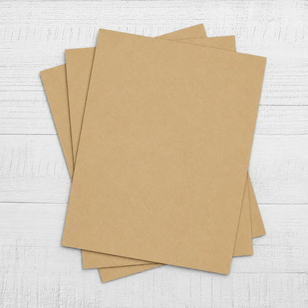
Kraft paper is a strong, durable and reliable material that is widely used across many different industries.
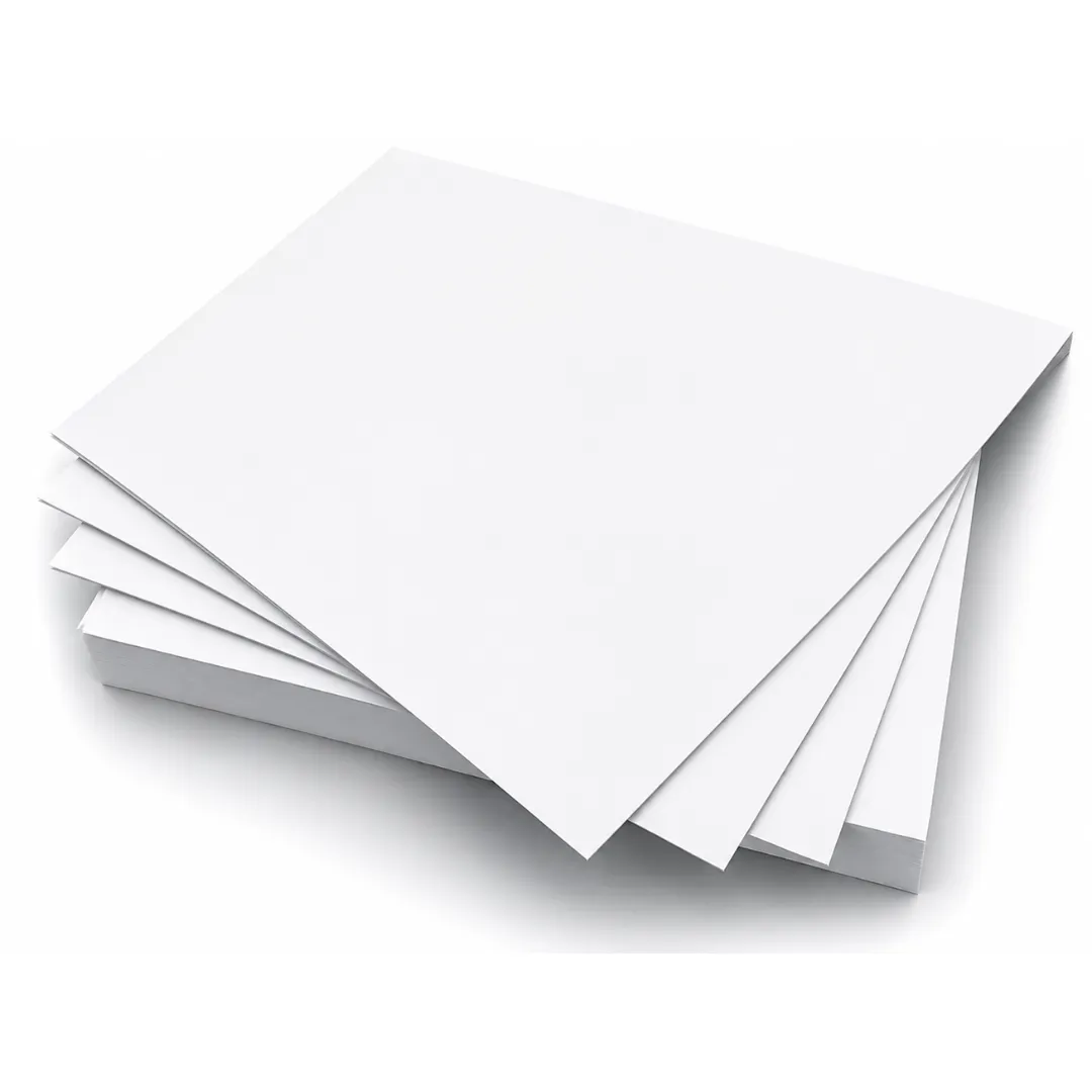
We use cardboard material with the least environmental impact and minimizes waste generation.
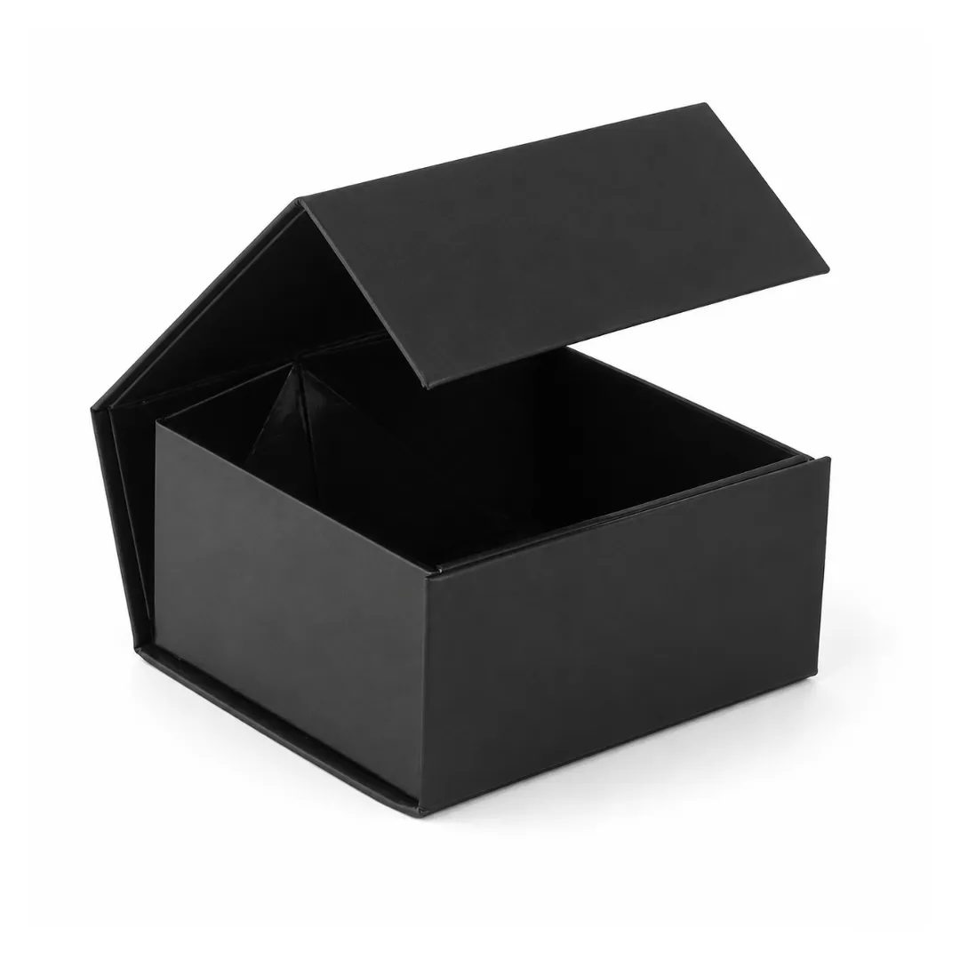
Rigid is highly protective, affordable and recyclable material. These boxes provide maximum protection.
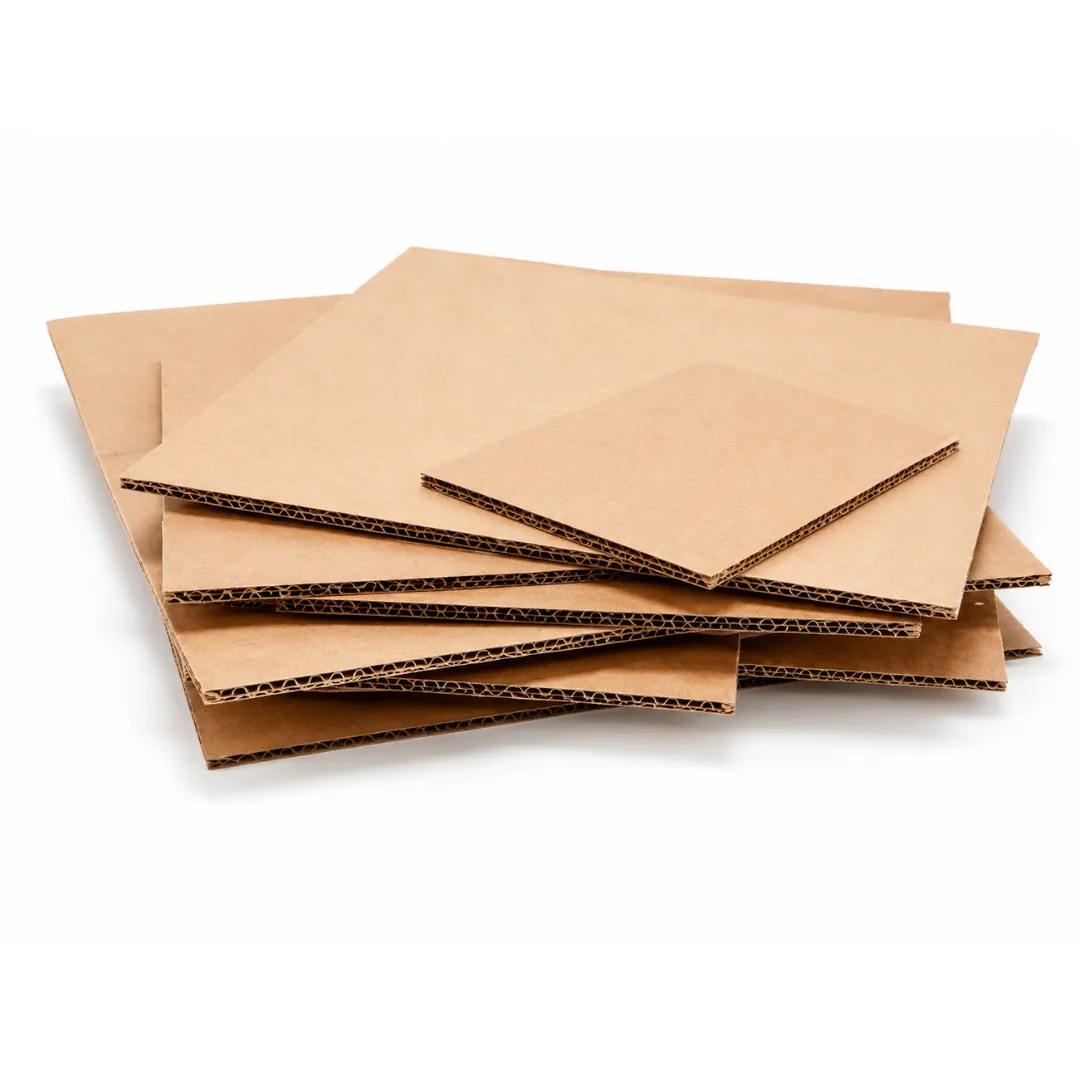
Corrugated material is easy to customize, cost effective and sustainable. It is also great for branding purposes.
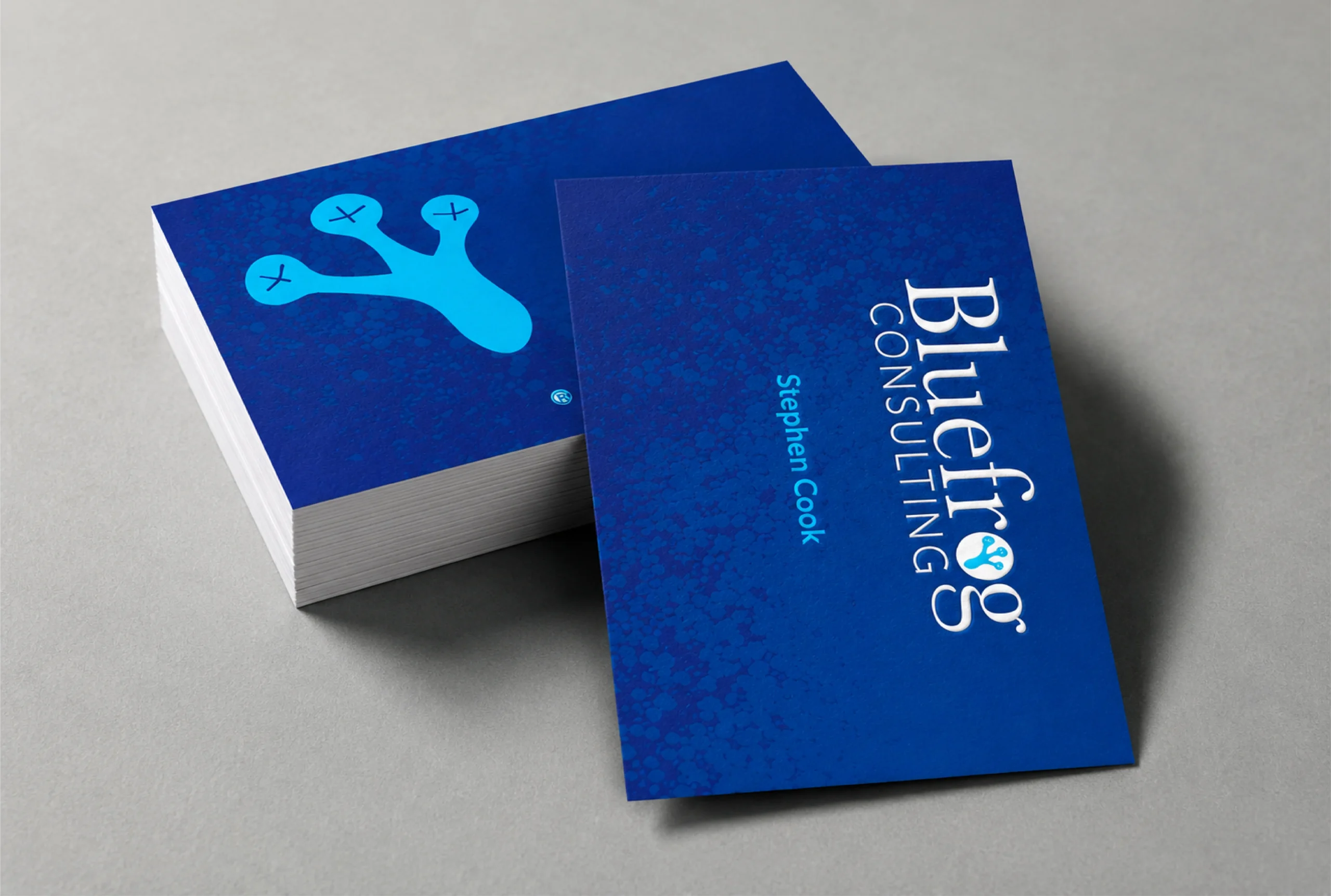
We add additional layer of protection with soft touch lamination from toner chipping.
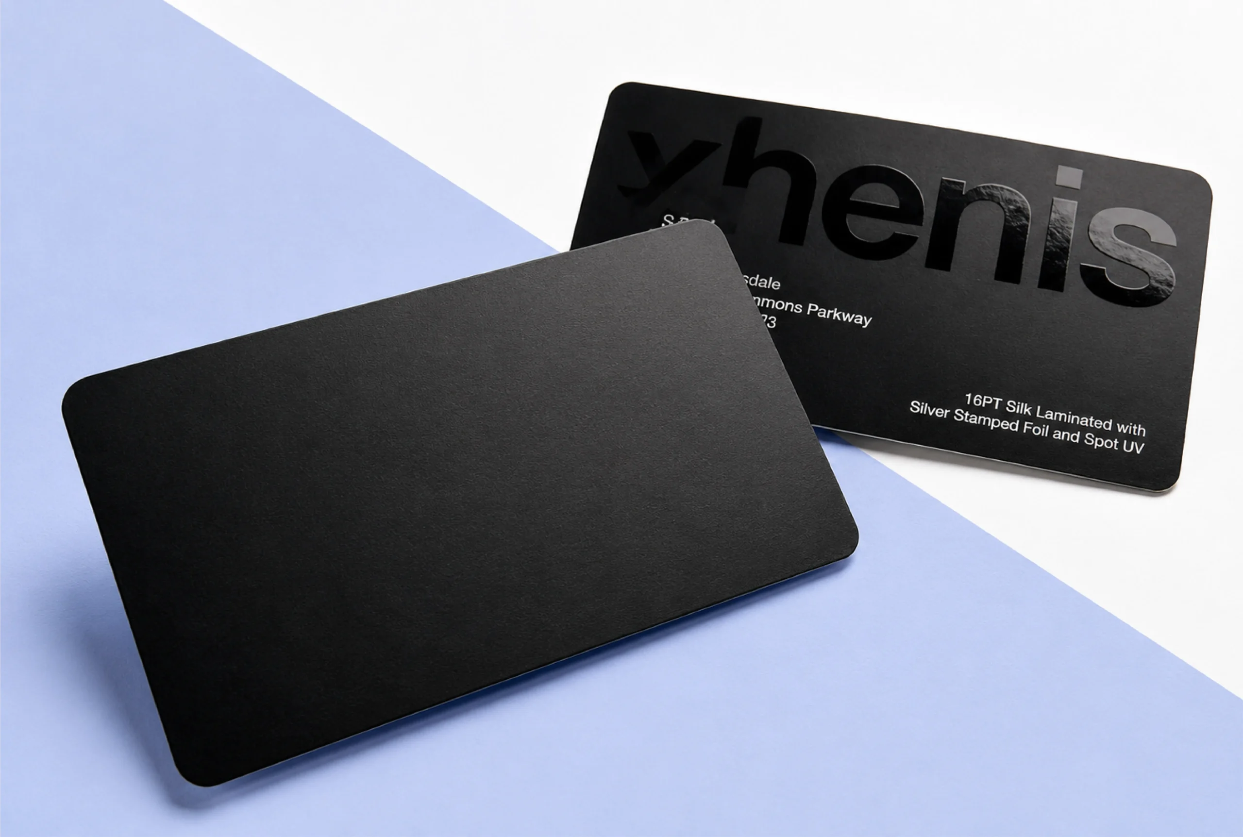
With our matte finish, fingerprints and smudges will now be less visible on the packaging.
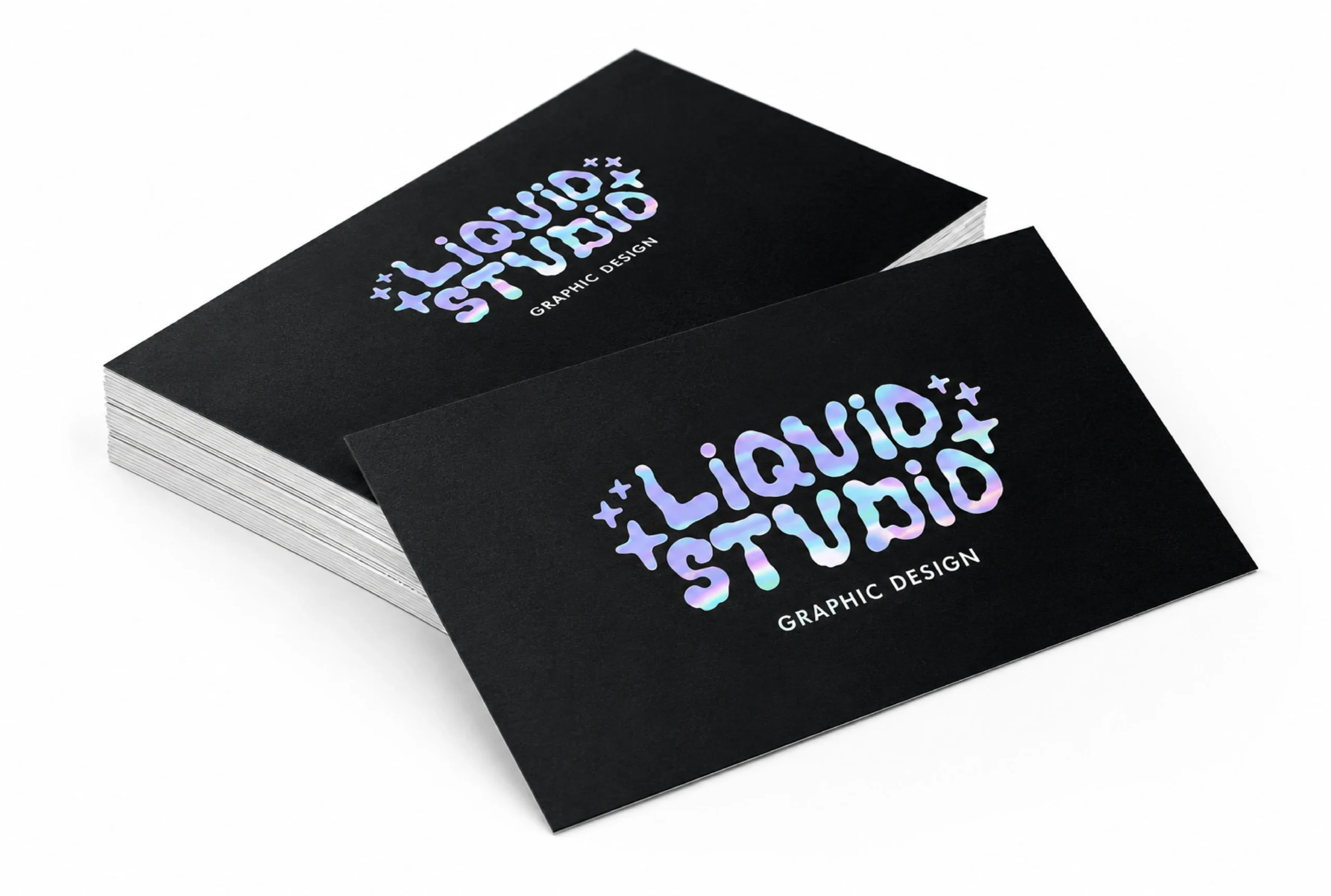
Holographic foil diffracts light and reveals the colors of the rainbow at various angles.
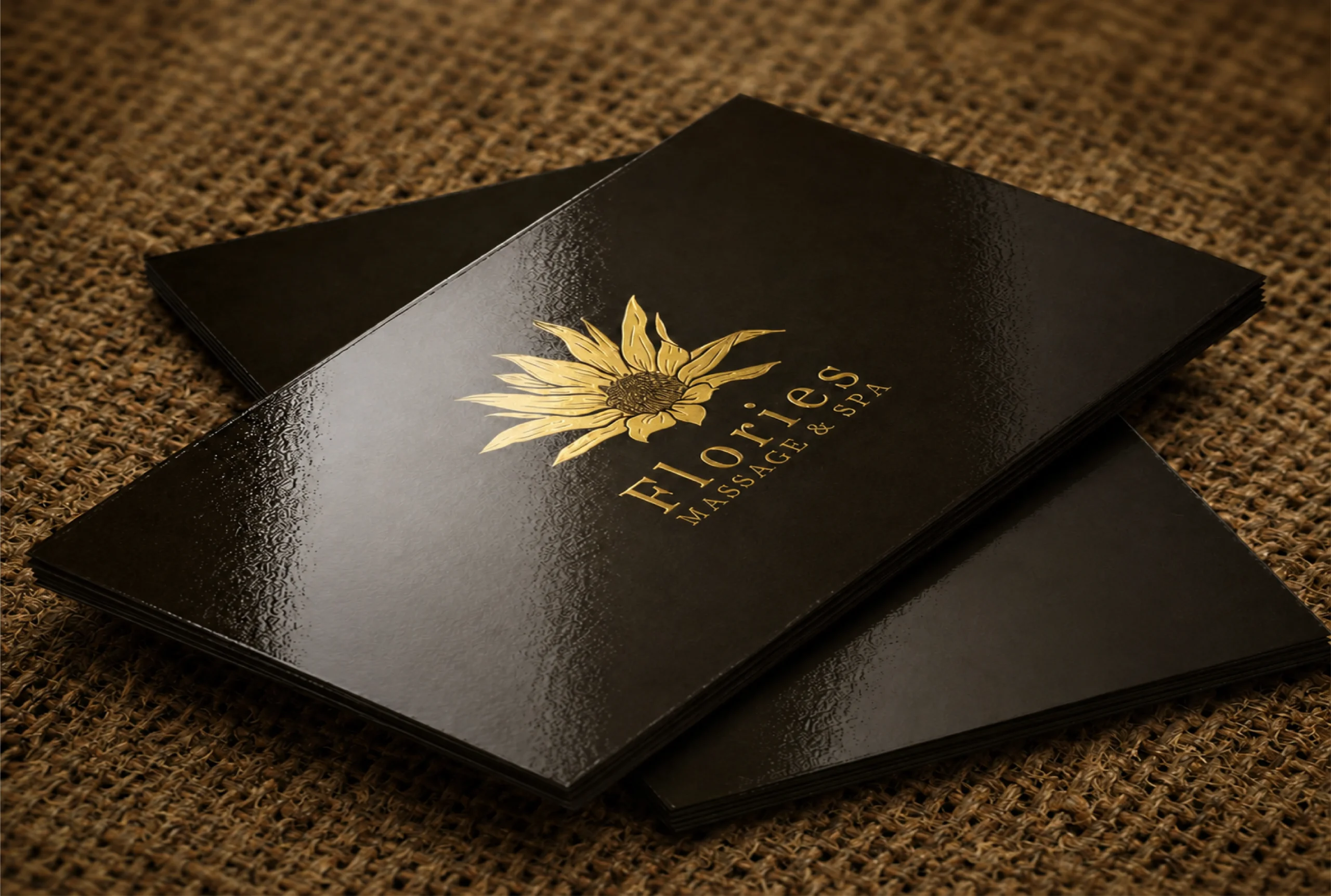
Our glossy finishing gives your packaging an extra layer of shine.
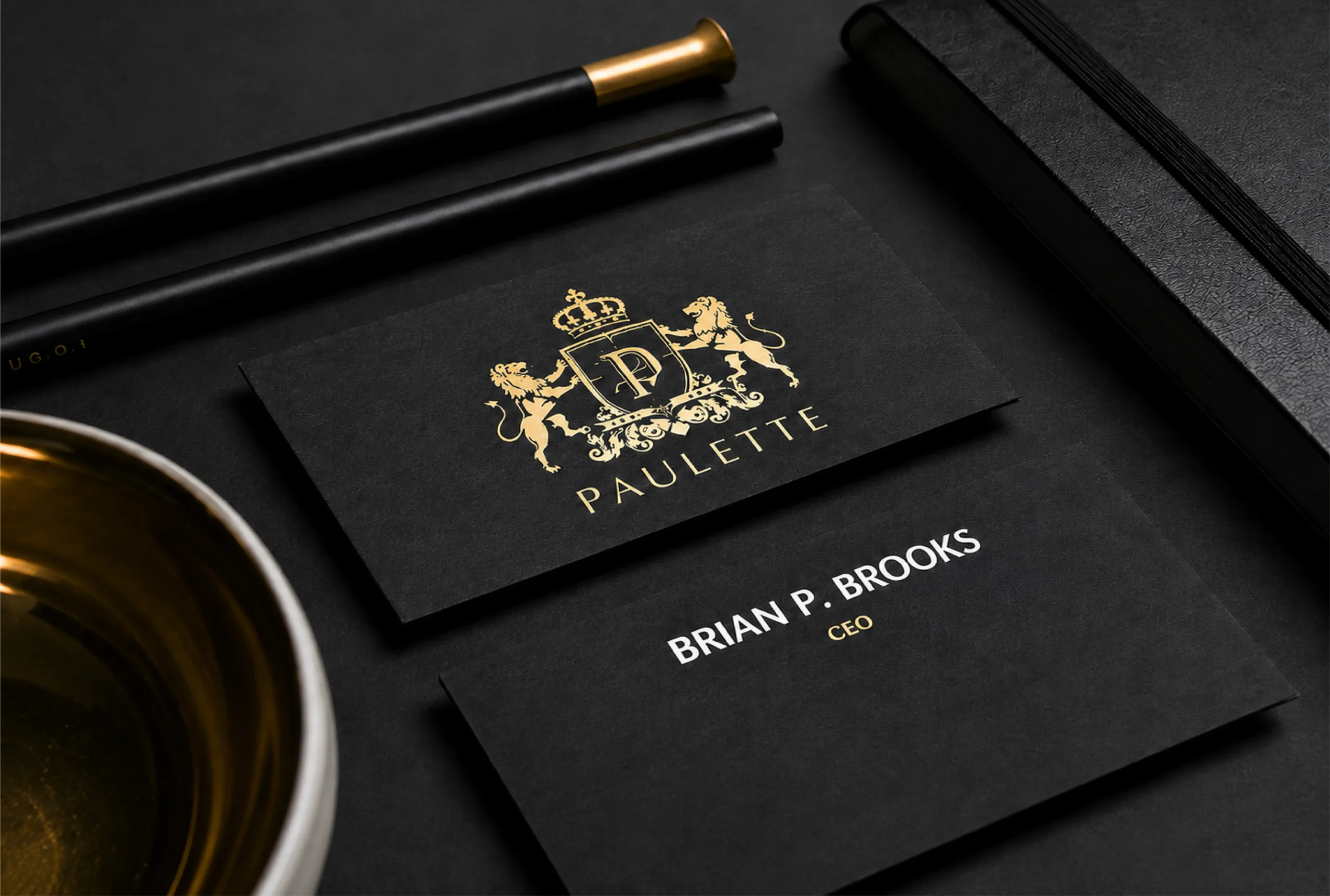
Decorate a wide range of your product packaging with our foil stamping.
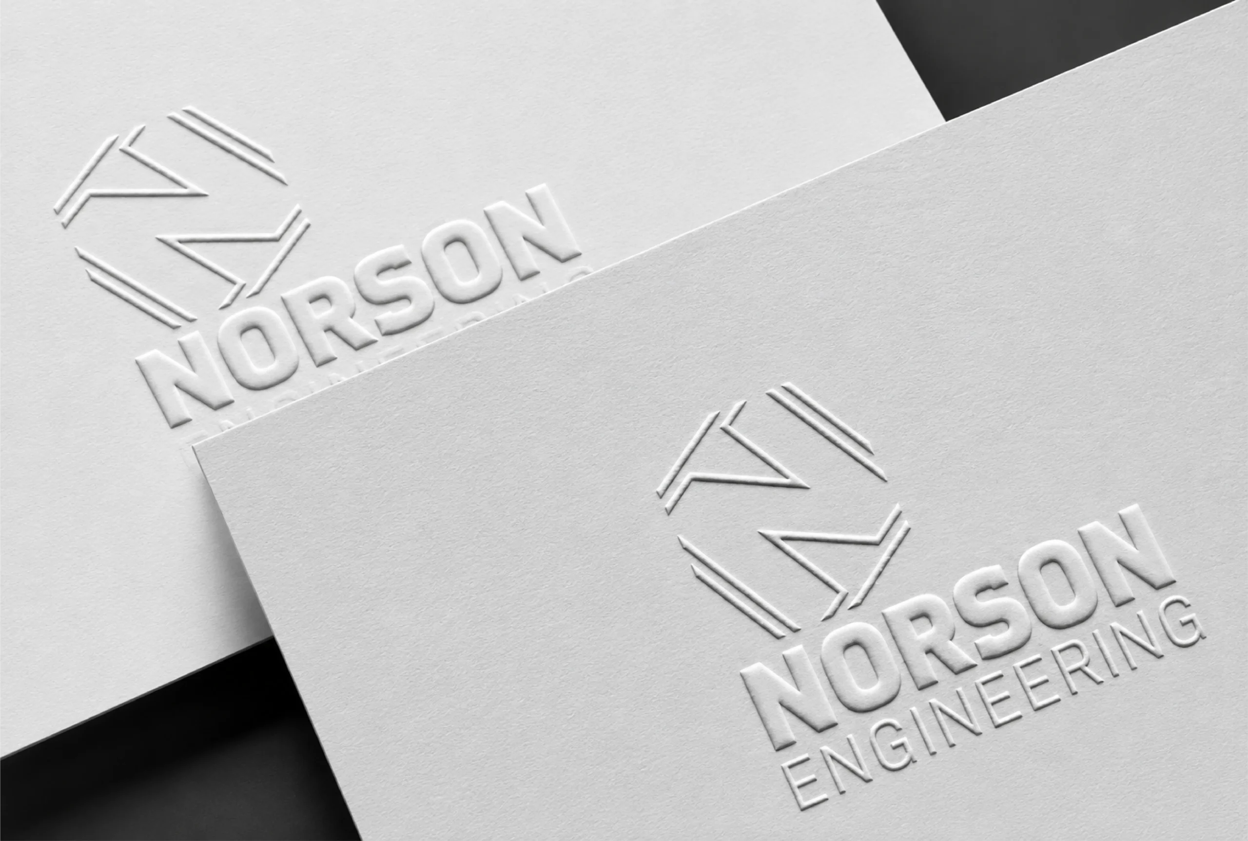
With our embossing technique, we transfer the finest details of your product on packaging.
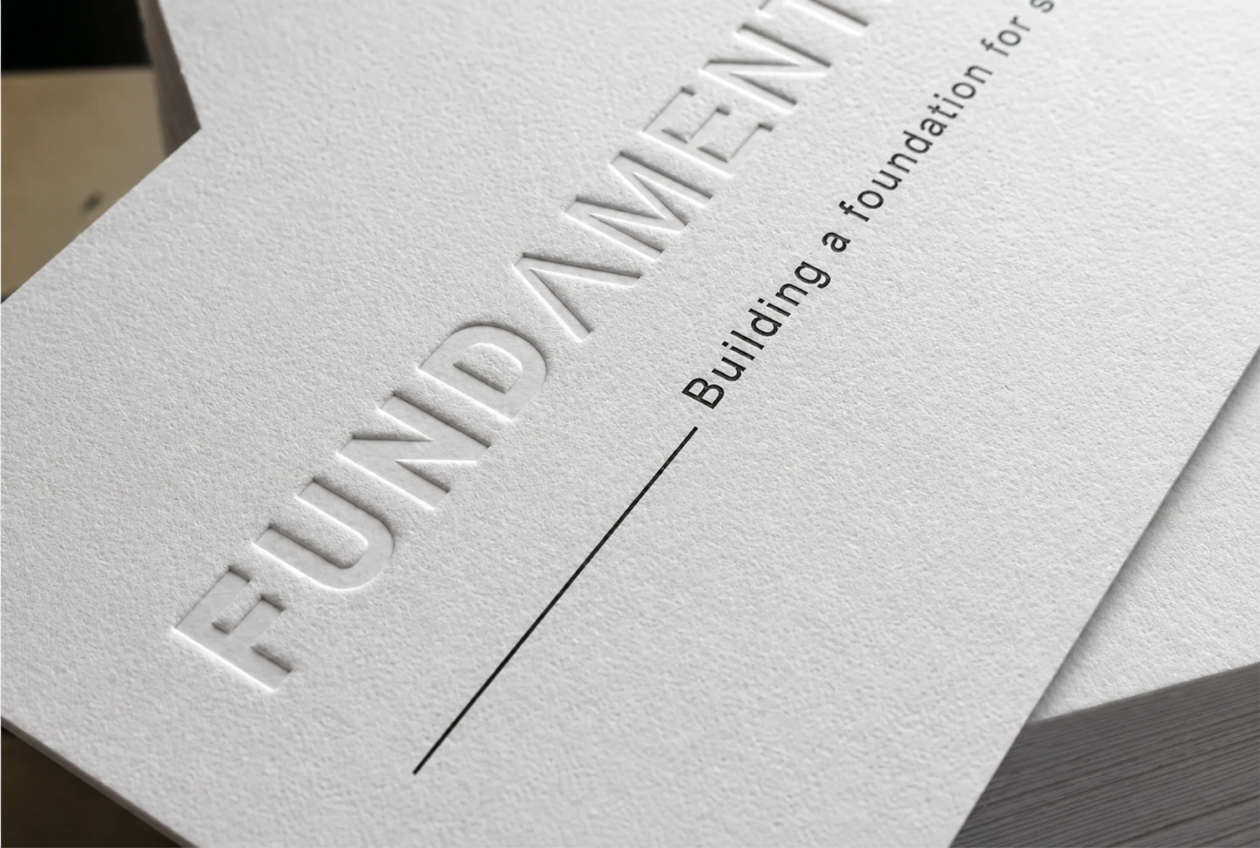
We use debossing technique to add unique graphics into your packaging.
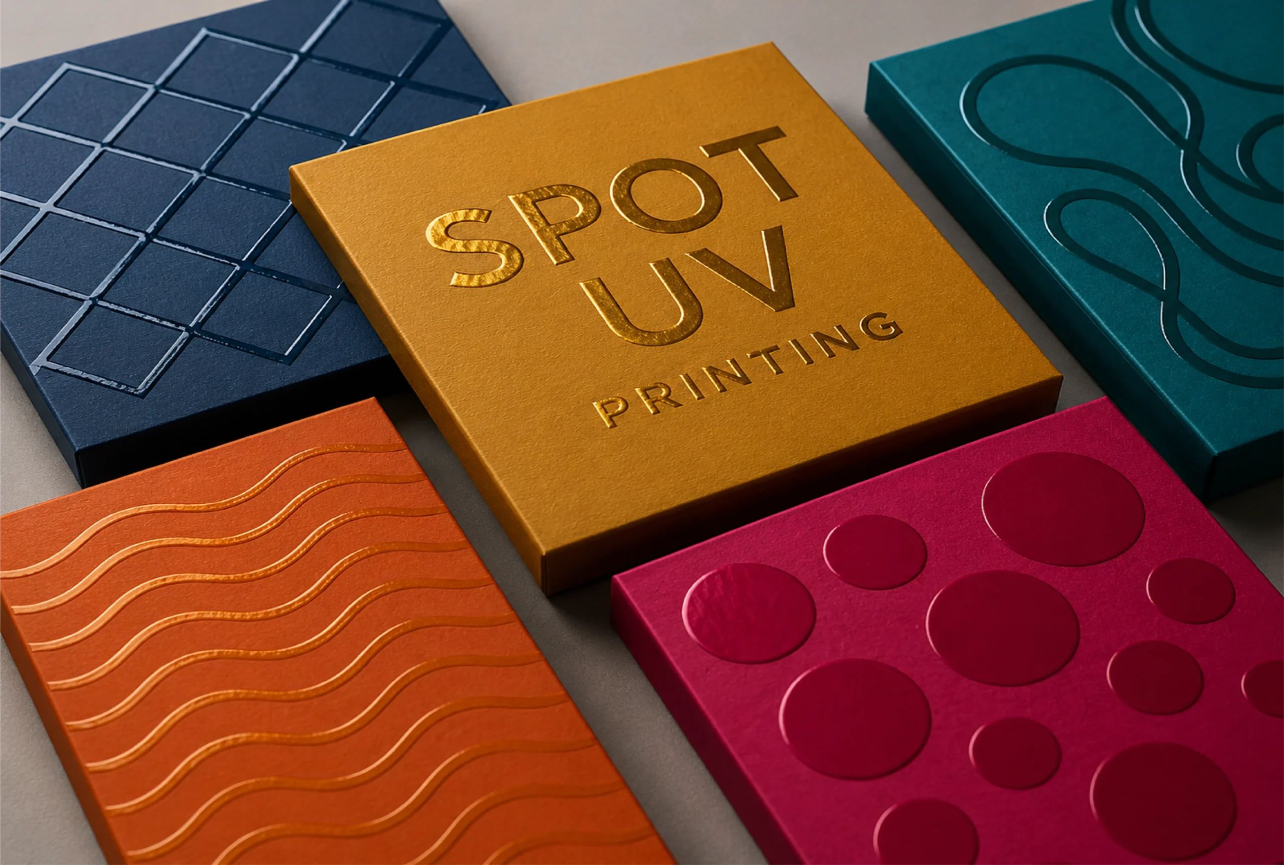
Our high-gloss UV coating gives light and shine to cure the printed material's varnish.
Still unsure? Email sales@packaginghubs.com and a packaging specialist will help.
Get your free quote today and see why Packaging Hubs is the most trusted name in U.S. custom packaging.